

GalleryPal
Guiding museum visitors through a fulfilling artistic experience
July 2021
Design Sprint (Bitesize UX and Springboard)

I sketched, designed, and validated an art museum visitor tool in a one-week “design sprint.”
The Problem
A BiteSize UX one-week design sprint challenge to analyze research and then design and validate a mobile phone application that improves the experience of viewing art in a museum.
The Project
Competitor analysis
Low-fidelity sketches
User testing research and analysis
High-fidelity prototype
The Solution
A high-fidelity mobile prototype that fosters a museum visitor’s sense of connection and interpretation when viewing art.
Background
The challenge was to “design a way to improve the experience of viewing art in a museum.” I generated my solution idea using the Google Ventures “Design Sprint” framework. I completed all stages of the process, including synthesizing the research, mapping out the problem, sketching solutions, building a storyboard, and creating and testing a prototype.
People visit art museums for many reasons. Some people have art history degrees, some are artists themselves, and some only visit museums every once in a while. All museum visitors, however, hope to leave the museum feeling they have experienced the art there to the fullest potential.
I am a lifelong museum visitor and have taken many studio art classes and art history courses. It was exciting to bring my personal interests together with my design skills to accept the Bitesize UX challenge and to build a product to help museum visitors have a fulfilling experience.
Deliverables
Competitor analysis
Low-fidelity sketches
User testing research and analysis
High-fidelity prototype
Users & Audience
Casual, non-expert art museum visitors.
Roles & Responsibilities (Solo project)
UX Research
UX Testing
UX Design
UI Design
Tools
Pen and paper, sticky notes, Sketch, Zoom
Scope & Constraints
I was constrained by the one-week design sprint framework, and by the materials provided by BiteSize UX and Springboard.
Design Sprint Process


Day 1: Map
Research synthesis led to an experience map focused on fostering a visitor’s sense of connection and interpretation.

I studied a challenge brief from BiteSize UX, which included key quotes from museum visitors, a persona named “Angela,” and an interview with a real-life museum guide Lena Carroll. I took notes in a notebook and on sticky notes. On a first pass, I organized my sticky notes into four categories:
Thoughts and feelings visitors have before coming to the Museum
What a guide might try to “impart” upon them during their visit
Examples of interesting specific pieces of information about artists’ processes
A guide’s hopes and dreams for what visitors might leave with
Then I took a second pass and reorganized the sticky notes in a new way. This time, I ended up with categories related to the:
Visitor
Artist
Art
It was interesting to notice that a guide, someone who knows art and the museum well, has their own hopes, dreams, and motivations. These might be different from what a visitor might think they want when they visit a museum. However, if Lena Carroll is a good example, then guides also seem to be very driven by helping the visitor, or “user,” and they know what has improved visitors’ experiences in the past.
Notes from the “Guide’s hopes and dreams” theme and the “Visitor” theme reveal some interesting insights:
Visitors like to get a “story” out of a piece of art.
A visitor’s experience is improved if they can form an “informed” opinion.
Looking “closely” helps build meaning.
Visitors want to feel like they’ve enjoyed artwork to its “full potential” and that they haven’t “missed out.”
Persona
I designed for a persona named Angela—a museum visitor who loves to browse and wants more quick information.
Bitesize UX provided a persona for the GalleryPal project. This persona represented the primary user for whom I designed.

Angela
23 years old
Junior Art Director
New York NY
Behavior
Since moving to New York a year ago, Angela has tried to take advantage of all the world class art and museums in the city.
She goes to the more popular museums every couple of moths—usually by herself.
Angela doesn’t really look for specific exhibitions or artists—she just goes and browses whatever work is being showcased.
Frustrations
Angela enjoys her visits, but feels like if she knew a little more, she would have a better experience.
Angela has tried to read some books and articles on the art she’s seen, but loses interest due to how long and in-depth they are.
Goals
Angela wants to get quick information while looking at the art that will give her better appreciation for it, and make her feel like she is making the most out of her visit.
“I enjoy going to the museum, but I often leave feeling like I didn’t appreciate the art to its full potential.”
— Angela, Bitesize UX
“I don’t need to know everything, I just don’t want to feel like I was missing out on something.”
— Angela, Bitesize UX
Persona credit: Bitesize UX
Problem Statement
How might we foster a user’s sense of “connection” and “interpretation” when viewing art?
User Map
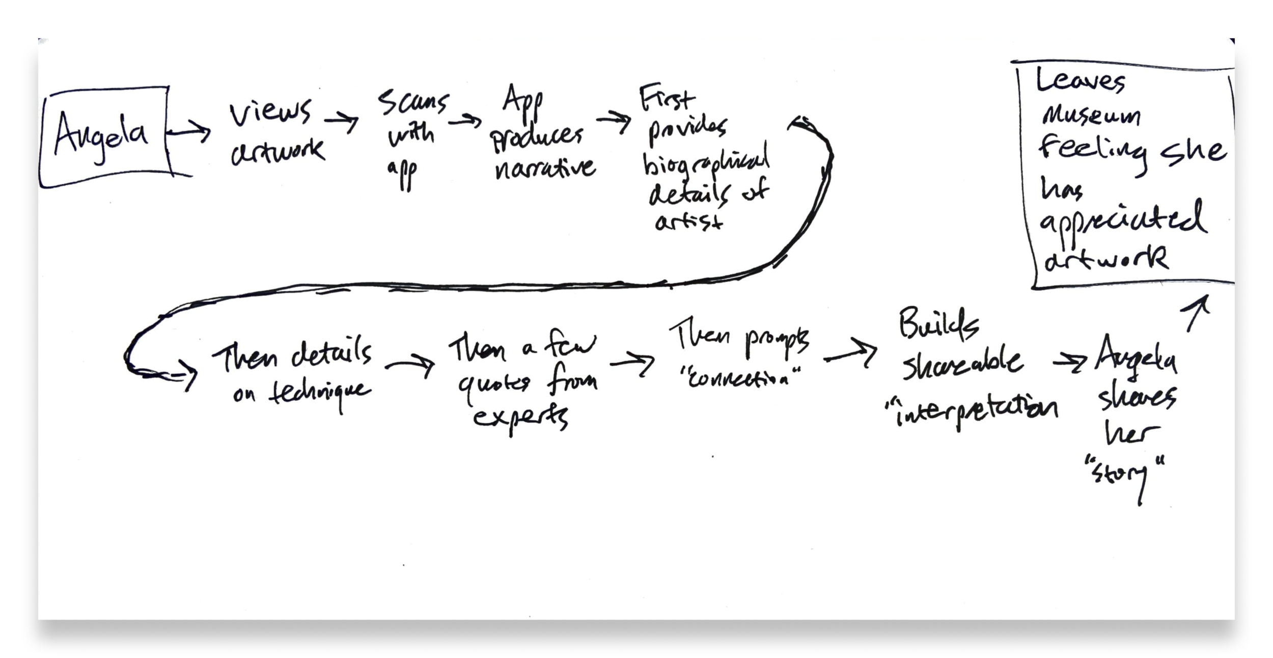
Mapping a visitor’s journey quickly revealed the need to focus on a sense of connection and interpretation.
After processing and synthesizing the research, I mapped out a few possible “end-to-end” experiences that a visitor might have with GalleryPal.
It quickly became clear that the moment of focus needed to be building the user’s sense of “connection” and “interpretation.”

Day 2: Sketch
A competitive analysis and some “Crazy 8s” idea generation produced a solution sketch for supporting a visitor’s moment of artistic interpretation.
Secondary Research: Competitive Analysis
There are many existing products that act as quick resources for information in cultural and natural landscapes.
I used a “Lightning demo” activity to study some analogous products: museum guides, art identification apps, and plant identification apps.

Idea Generation: “Crazy 8s”
After researching similar existing products, I generated ideas for the critical “connection and interpretation.”
I used a “Crazy 8s” activity to focus on the screen where a visitor will be invited to record and share their own interpretation, impressions, or connections with a piece of art. This is when a visitor might be able to create their own story about this artwork, and help them leave a museum with their own opinions about what they saw.

From these ideas, I generated a solution sketch of the critical screen of connection and interpretation.
Solution Sketch

The preceding screen is the last in the “story” of screens about the piece of art.
The critical screen includes drop-down menus for the “Artist,” “Technique,” or “Artwork” buttons, and a text input box for typing in their own personal note about the piece of art.
The third screen is what it might look like to “share” the visitor’s personal generated story about their visit on social media (e.g. Facebook).

Day 3: Decide
Storyboard
I created a storyboard for the flow from viewing a piece of art to sharing or recording a personal “post” about it.
It involves the app telling a “story” about the artwork—the artist, the technique, and quotes from experts—and then inviting the user to create a little post. This post could be just for themselves, shared with a Notes app, or email, or to Google Drive, or something—or it could be shared on social media or a messaging app.

Landing screen
Artwork summary screen
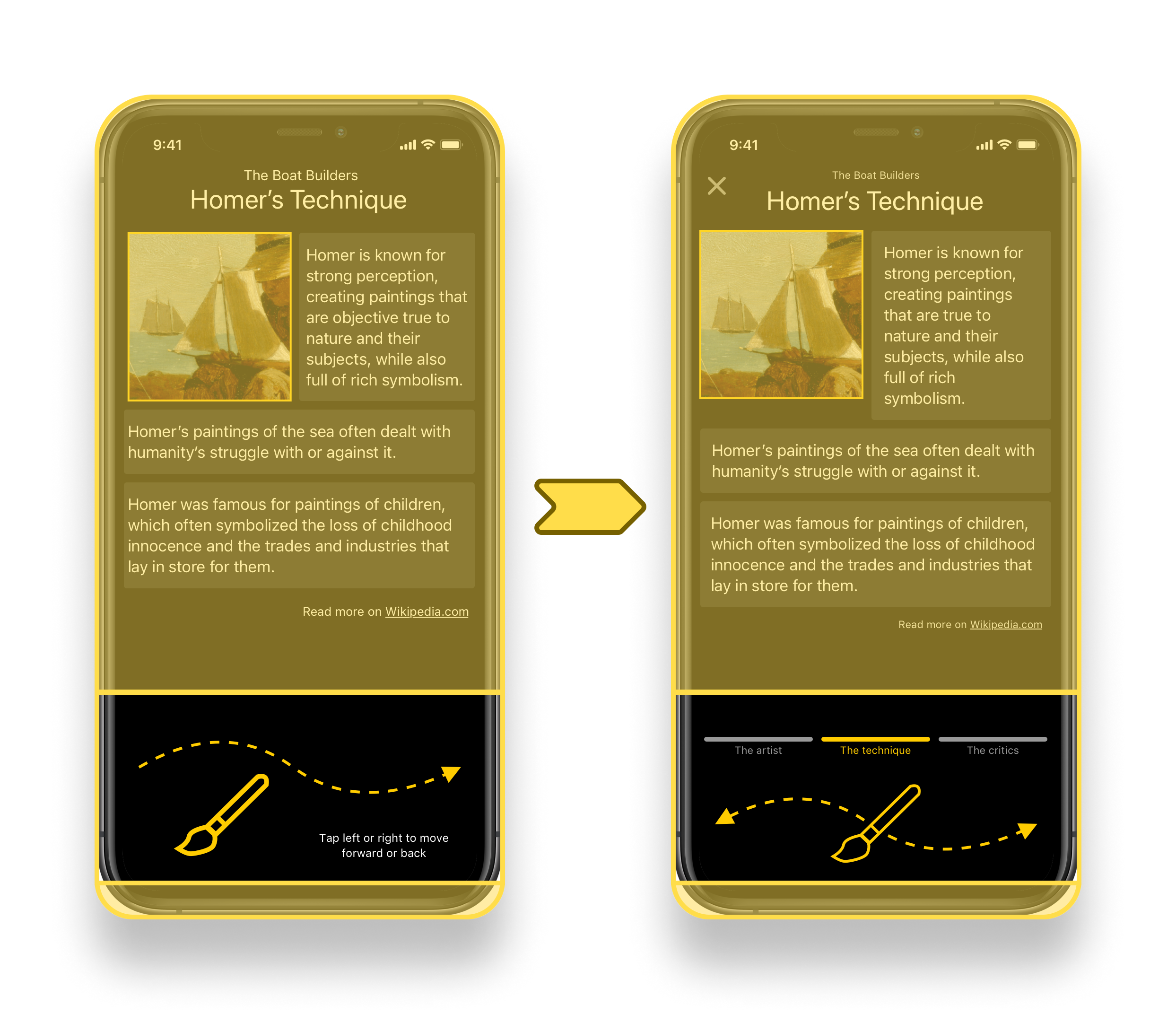
About the artist
About the technique
Critics’ thoughts
“Create a post” screen
Drop-down for creating a post
Filled in post
Share menu
Share to Facebook
“Thank you” message
Back to the landing screen
I ran into a few moments where there might be a drop-down menu, and ultimately a creative piece of UI design that could engage a visitor while they are looking at art in the real world in front of them. Elements like that would obviously need much further development.

Day 4: Prototype
The prototype needed to provide just enough value to its testers to evaluate the merits of the central design concept.
Developing the prototype involved trying to create crisp and clear screens that get a user through a route from their first viewing of a piece of art to a final “post” about their impressions. I hoped that this prototype would validate (or invalidate) the concept of helping a user “get something out of” visiting a museum by reflecting on what a piece of art “means to them.” It involved some research into a painting, and drew on my own art history and education background.

Landing screen
Artwork summary screen
About the artist
“My Impressions”—Screen 1
“My Impressions”—Final screen

Day 5: Validate
Five participants, all museum visitors themselves, affirmed the value of the product idea and provided helpful insights for future development.
I conducted user interviews and ran usability tests with five different museum-goers. I reached these interviewees through a survey that focused on finding people who enjoy museums, visit them a few times a year, and would choose to visit a museum if they traveled to a new place. Interviews included men and women between ages 30–60, with various careers and hobbies.

The Findings
The interviewees had affirming feedback and productive ideas for more work to be done.
The concept was successful!
Users liked the idea of being able to quickly identify artwork, learn about it, and create a post about it. Different users had slightly different priorities around “cataloguing” or “sharing” their impressions.
Good scale and scope.
Users thought that the depth of content provided was appropriate, provided that the content cards would either be able to expand or click out to a deeper source of information.
Good visual design, with room for growth.
Users thought that the colors and designs of the interface were clean, simple and effective. There were some questions and issues with the navigation, only because the first screen uses one style and the later screens use another. The navigation needed to be revised for consistency and clarity. There were also some questions about the particulars of the “Impressions” page.
Iterations
Further revisions were based on the results of the usability testing.

Added a viewfinder on the camera screen.
Revised the navigation panel to provide more information for the user about their location on the flow, flexibility of movement, and better visual balance.

Revised the “impressions” screen further for more clarity on possible “editing” actions and better visual balance.

Cleaned up the primary results “Home” screen, including typography work and improving the navigation panel at the bottom.

Revised the “impressions” screen for more clarity on possible “editing” actions, better visual balance, and to add a “save” button.

Outcomes & Lessons
The result of the design sprint was a validated solution idea with a clear path forward.
This “GalleryPal” solution was informed by research, design methods, and validation from user testing.
Moving forward, there are many ways that GalleryPal could expand beyond its minimum viable product. Some ideas include:
More variety of “detailed screens” for information about the artwork and artists.
Audio and video features.
Customization options for specific museums and exhibits.
“Where am I?” tool for locating a user within a museum or site.
