

Accessibility Improvements
Supporting all writing instructors and students
September 2022–February 2023
Design methods, research, and project management
Groundbreaking accessibility improvements for a writing instruction tool.
An educational technology suite of tools serving 1.85 million users includes a writing product for higher-education instructors and students. It is a robust platform on which students can write essays, receive feedback from instructors and peers, and revise in multiple drafts.
An audit by the company’s accessibility partners revealed that the feedback elements and functionality were inaccessible for several different cohorts of users.
I led the team that redesigned the feedback experience to be accessible for all users.
The Problem
Feedback experience in a student writing application did not meet accessibility standards.
The Work
Audit with an accessibility focus group
Ideation
Internal reviews and critiques with accessibility focus group
High-fidelity designing
Working with engineers to bring designs to fruition
The Solution
High-fidelity concepts and prototypes that are fully accessible visually, cognitively, and for screen readers. Deployed for Fall of 2023.
Deliverables
Wireframes
High-fidelity screens
Figma prototypes
Users & Audience
1,300 college and university writing instructors and students
Roles & Responsibilities
Workshop Moderation
Stakeholder Management
UX Research
UX Design
UI Design
Tools
Pen and paper, Figma, FigJam, Stark Contrast & Accessibility Tools

Discover
Common practices
Review common practices in competing and analogous products.

There are many writing platforms and word processors on the secondary and higher-education market. There are also analogous products that feature some similarities in function and experience. Examples include highlighting and writing notes in eReaders, leaving comments and having discussions in graphics design software, and websites that allow artists to annotate their work for viewers.
We collected and analyzed examples, synthesized our findings, and presented what we learned to the project manager, product owner, other designers, and our accessibility partners.
Discussion with experts
Review the detailed audit by our accessibility partners.

The company works with a group of accessibility experts who performed an audit on this product. After reviewing their report, I met with them to ask follow-up questions. I also planned for their consistent access and involvement to the project as we moved forward.
Design
Solution ideation
Complete several rounds of idea generation, review, and analysis.

I led several sketching sessions with other designers, researchers, and product partners. We then analyzed the ideas, looking for similarities that we could pull out into a couple paths forward.
Wireframing
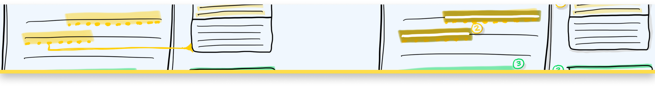
Identify several approaches based on ideation process.

Screen A
Issue: The only indication that a passage of text has an associated comment is through color.
Solution:
1. Dashed underline
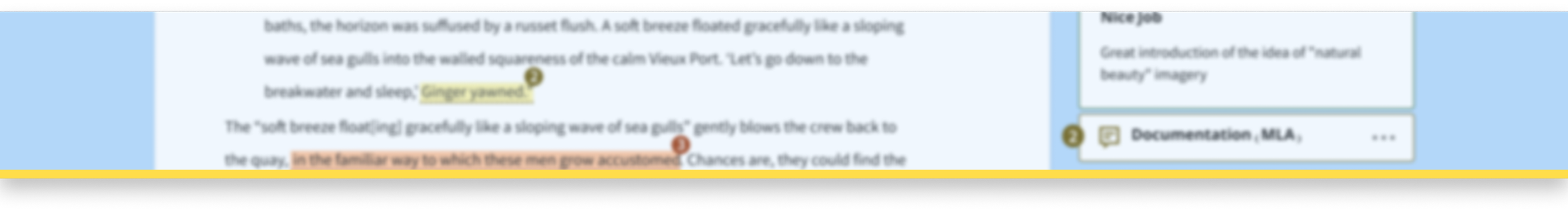
Issue: There is no connection between the highlighted text and the comment in the sidebar.
Solutions:
2. Putting both student and instructor text in same box
3. Pointer Lines
Screen B
Issue: The only indication that a passage of text has an associated comment is through color.
Solutions:
1. Dashed underline
2. Invert on active state
Issue: There is no connection between the highlighted text and the comment in the sidebar.
Solutions:
3. Putting both student and instructor text in same box
4. Number indicators
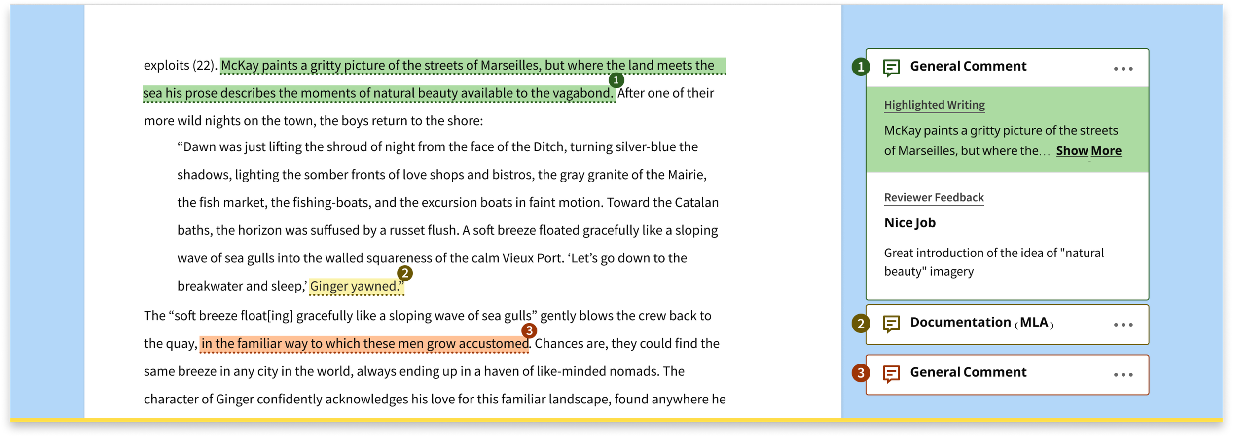
Based on their feedback, we chose a few elements of our designs to combine into the final path forward in final wireframes, high-fidelity screens, and prototypes. Solutions addressed the need for clear screen-reader behavior, color accessibility, and clear connections between in-text indicators (like highlighted text) and their associated comments.
Validate
Internal Reviews
Review final designs with a multidisciplinary team and our accessibility partners.
I led several review sessions with designers, researchers, and our product partners. I then synthesized the feedback, conversations, and ideas and integrated them into the designs.
“If these designs go into production this would be the most accessible writing feedback experience on the market.”
Stakeholder Management
Known Issues
Areas that need further research.
The design team was concerned about the color palette used for different types of highlights and comments. There wasn’t time or bandwidth for exploration in this area, and so we had to work with the colors that we had. This led to some lively discussions of the design’s handling of some edge cases!
Future work
Design elements and outstanding questions.
Due to engineering bandwidth and farther-reaching work needed on the color palette, some design elements were left out of the first round of development. We worked with the product team to line up the future engineering and UX research needed to make sure we wouldn’t lose those aspects of the designs.

Outcomes & Impact
Deliverables
We worked closely with designers, researchers, engineers, and accessibility experts to design an effective and accessible writing feedback tool.
At the end of this project, we delivered:
Detailed and focused competitor research
Documented design process
Wireframes
High-fidelity screens
Next steps
We generated a backlog of research to be done, including monitoring plans and engineering and user research. The research is ongoing!
Impact
The new feedback and commenting tool introduces groundbreaking new patterns while solving known pain points and making it a fundamentally more accessible experience.
Patterns in this feedback tool are now being adopted in other parts of the courseware product, and this accessibility-first approach is now the standard on this team.
Lessons & insights
-
Pulling the threads of design concerns early in the process avoids difficult conversations about priorities at the end.
-
Leave room for questions from stakeholders early in the process.
-
Regular reviews with accessibility experts help keep accessibility a priority.