

Building with AI
Two apps built from scratch with Claude as a collaborater
Timeframe: March–April 2026
Methods: AI-directed development, iterative prototyping, content curation, cross-platform design
Platforms: Web, iOS, Android
I have never written code. Not in a real way. As a UX designer, I understand how code is structured—what different languages are used for, why certain architectural decisions matter—but that understanding has always been theoretical. My only hands-on experience was an introductory programming class in high school in 2004.
In March 2025, with some time on my hands and a few ideas, I set out to change this. Not by learning to write code from scratch, but by working with an AI tool to build something real. I had two goals: 1) learn to make things that I actually, personally, want in the world, and 2) develop a real workflow for AI-assisted development—one I could apply to future projects, and that would make me a more effective collaborator with engineering colleagues in the future.
The result is two live consumer apps: Refrain, a folk song verse app available on the web, iOS, and Android (coming soon), and Tuning Note, a reference tone app for string players on iOS. Both were built entirely in collaboration with Claude.
I made all product, design, and creative decisions. I designed both app logos independently, with no AI assistance. Over the course of both projects, I took on more and more of the smaller code edits myself—adjusting copy, changing margins, modifying text styles—while continuing to direct Claude on anything architectural.
Refrain
Tuning Note
How I Worked
The process developed as I went along, and it will continue to evolve.
Structured Projects from the start
For each app, I created a dedicated Claude Project and maintained an up-to-date library of all relevant files. Every Project also included a living technical reference document—what files existed, what each one did, what workflows and quirks applied. This meant any new conversation could get to work immediately rather than re-establishing context.
One change at a time
Early on I was reminded that asking Claude for four things all at once consistently introduced hard-to-trace errors. Instead, I established a habit of giving Claude a list of tasks, but then required we work through them one item at a time, with alignment checks between each round.
Figma as a communication medium
Descriptions alone weren't always enough for visual and interaction decisions. I used Figma regularly—sketching interaction concepts before any code was written, mocking up UI changes that were hard to describe in words, and providing Claude with visual references rather than relying on language to carry all the weight.
Periodic review of code structure
Every so often I'd ask Claude to look at a section of the codebase and evaluate whether it was as elegant and simple as possible. Specifically, I’d ask whether a new engineer with no context could pick up the files and understand them. This kept the code from accumulating unnecessary complexity over time.
Taking on more, over time
By the end of this process, I was editing code directly for smaller changes rather than asking Claude to make them. That shift happened gradually, as I got more comfortable reading the files and understanding what was safe to touch. The bigger structural work—refactoring components, debugging cross-file issues, implementing new features—stayed with Claude.
Spotlight:
Refrain
I am a folk singer, musician, and dancer in my spare time, and I love the idea of introducing small elements of whimsy to these screened devices in our pockets. Refrain displays a single stanza from a traditional folk song, chosen to match the user's current time of day and season. The verse rotates every 15 minutes, or on demand. Tapping it opens the full song lyrics.
Check out the published app on the web and in the Apple App Store.
Under the hood
Web: React + Vite, deployed via GitHub → Vercel
iOS: SwiftUI + WidgetKit, live on the App Store
Android: Kotlin + Jetpack Compose, in testing
Content pipeline: Per-collection JSON files merged by generator scripts at deploy time
Theming: 16 hand-tuned palettes (4 times of day × 4 seasons), applied via CSS custom properties on web and matching Theme files on iOS and Android
Quote library: ~223 approved verses across 12 public domain folk song collections
The central design decision
The 16-theme grid—four times of day by four seasons—is the architecture the entire product is built around. Every piece of the stack, from theming to content to UX, was organized around that grid from the start. Morning and night are the strongest slots in the folk tradition; afternoon is genuinely thin, and I had to accept that some parts of the grid will always be smaller than others.
Visual design
The initial color palette came from my description of the app: a seasons-based experience rooted in the natural imagery in old folk songs. Claude proposed a starting palette; I refined it through iteration. Getting 16 distinct palettes—each readable, each evocative of its moment—required several rounds of back-and-forth, and Figma was useful for evaluating options between rounds.
The typeface, IM Fell English, was Claude's suggestion. It's a digital revival of a 17th-century face that fits the folk song material without feeling costumed. I kept it.
The hierarchy on the page and in the home screen widget came from my written descriptions of what I wanted, rendered by Claude, then refined through multiple iterations I managed closely.
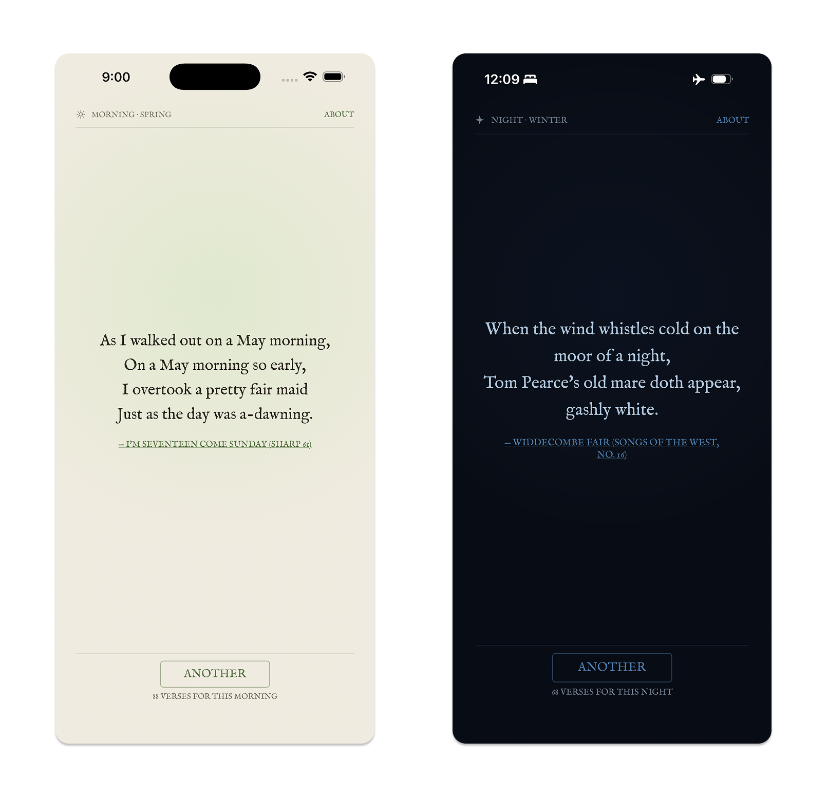
Two theme states—a spring morning palette and a winter night palette.
The curation workflow
The content in Refrain is the whole point. I worked through more than 3,000 folk songs across 12 collections to find the ~223 verses now in the library. All 12 collections are fully triaged.
We started with the Child Ballads, the largest collection. I described to Claude what I needed: scan the collection, identify verses with explicit references to time of day or season, and assemble candidates with full metadata. Working through the initial findings together established the nuance quickly—what counts as a morning image, what doesn't, how self-contained a verse needs to be to work in context. Out of that first pass came a documented set of curation rules that applied consistently to every subsequent collection.
From that point, I could open a new conversation, name a collection, and say "let's curate this one." Claude would scan the text, present candidates in batches, and flag borderline cases. I reviewed and approved or rejected every verse. The curatorial judgment stayed with me; the work of scanning hundreds of pages was something Claude could do quickly and consistently.
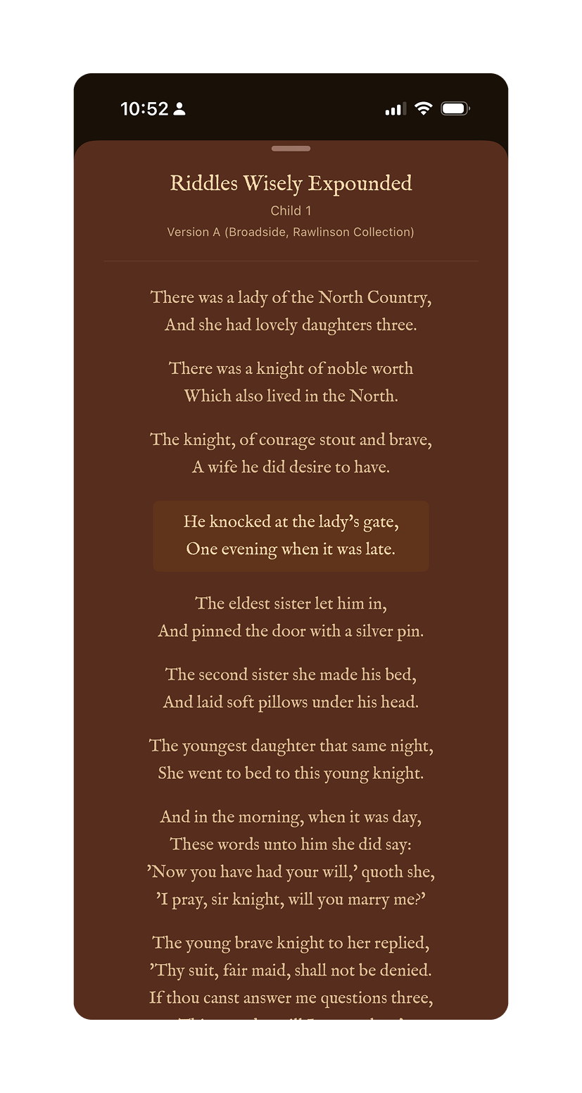
A curated quote with the source attribution visible
Managing three platforms
Once the web app was live, I moved to iOS. Then Android. By then I had three separate codebases sharing the same content but structured differently on each platform. Any content update required running generator scripts and either pushing to Vercel (instant) or building and resubmitting to the App Store or Play Store (gated behind review cycles).
Keeping those files straight became a real management exercise. On a few occasions—about three times—a session started from an outdated or deprecated file, which introduced errors that required real troubleshooting to unwind. Better Project hygiene fixed it: keeping the reference document current and being explicit at the start of each session about which file version we were working from.
Spotlight:
Tuning Note
As a musician, I know there are hundreds of mediocre tuning apps and websites out there. After a conversation with my sister, also a musician, I decided to try building my own. Tuning Note plays a sustained reference tone for any chromatic pitch across the range of a selected string instrument—violin, viola, cello, or bass—so a player can tune against it by ear.
Check out the published app on the Apple App Store.
Under the hood
Platform: iOS 16+, SwiftUI, live on the App Store
Architecture: 7 Swift files; navigation state managed by a dedicated NoteNavigator class
Pitch system: 61 chromatic pitches (C1–C6), with per-instrument profile slices defining range and default pitch
Audio: Sustained sine wave synthesis with second harmonic and tremolo; configurable A4 reference frequency (415, 440, 442, 444 Hz, or custom)
Instrument profiles: Violin (G3–C6, default A4), Viola (C3–A5, default A3), Cello (C2–A4, default A3), Bass (C1–G3, default G2)
Starting with a sketch
Before any code was written, I sketched a diagram in Figma showing how the note wheel should work: all 12 chromatic pitches arranged around a large imaginary circle, the selected note sitting at 12 o'clock, adjacent notes arcing in from the sides. Each note tilts tangentially to the rim—upright at center, leaning clockwise to the right, counterclockwise to the left, as if standing perpendicular to the radius at that point.
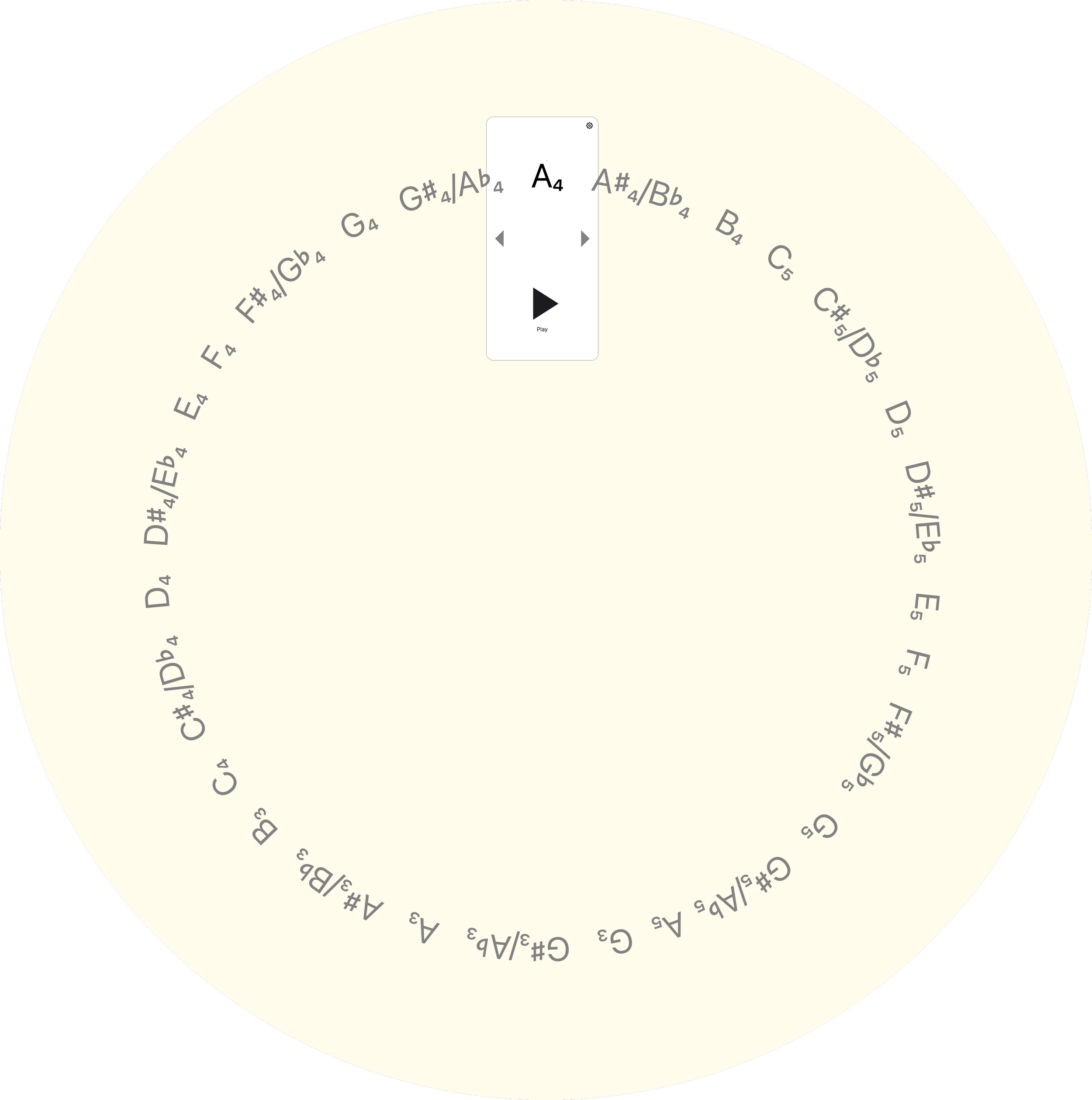
A Figma sketch illustrating the conceptual architecture of the wheel of notes.
That sketch went to Claude as the primary implementation reference. The first build produced a working app—drag and tap navigation, sine wave synthesis, configurable tuning. Then the iteration began.
Refining the animation
The animation required the most back-and-forth of anything in either project. The original implementation moved notes horizontally, in a flat line. That wasn't what I wanted. Getting the arc geometry right—the radius, the tangent rotation, the drag direction—took several rounds of precise description and correction. The drag direction was initially inverted. The arc curvature needed recalculation. Opacity behavior on adjacent notes was refined.
The experience made clear that, unsurprisingly, describing motion in words is hard. The quality of what Claude produces in these areas tracks closely with the precision of the input. A vague description gets something technically functional but wrong in feel. A precise one—including the sketch, and specific language about what the drag should feel like at the boundary—gets something much closer.
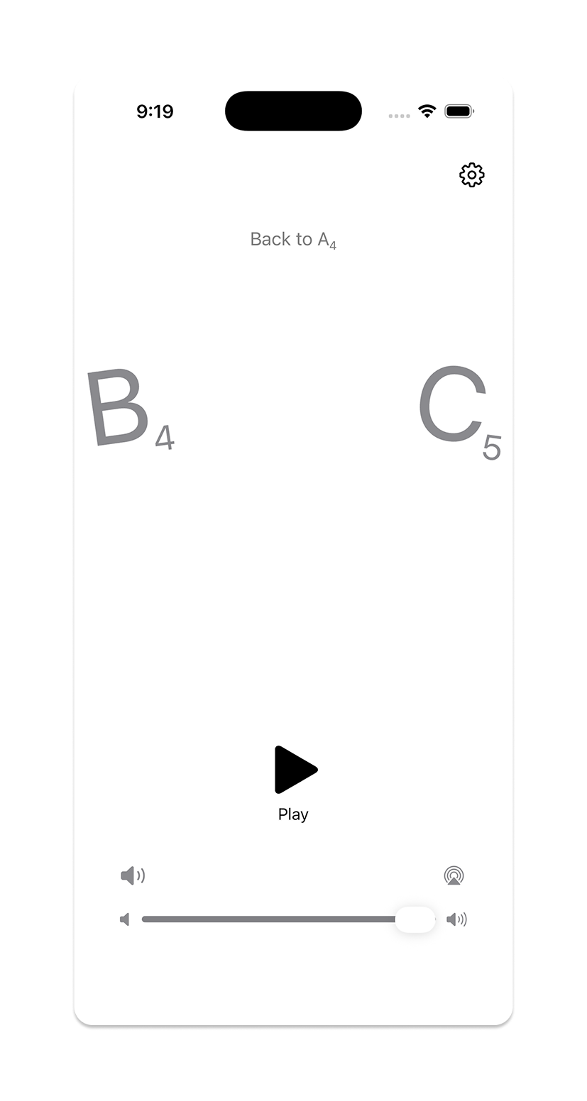
Moving between notes on the Tuning Note wheel
Refining the audio
A raw sine wave sounds mechanical in a way that's immediately apparent when you're using it to tune an instrument. Adding a second harmonic and tremolo made the tone feel more useful. Debouncing was also added to tone updates during fast drags, to prevent audio clicks as the wheel scrolled through intermediate notes.
Post-launch: expanding to all string instruments
The first version covered violin range only. A post-launch update expanded to all four orchestral string instruments, which required rethinking the pitch system from a fixed list to a master list (C1–C6) with per-instrument slices. This also prompted a structural cleanup: what had been a collection of state variables scattered through the main view was extracted into a dedicated NoteNavigator class, making the instrument-switching logic—and the codebase generally—much easier to reason about.
That cleanup came directly out of one of the periodic simplicity reviews. The restructure was Claude's, but the prompt to do it was mine.
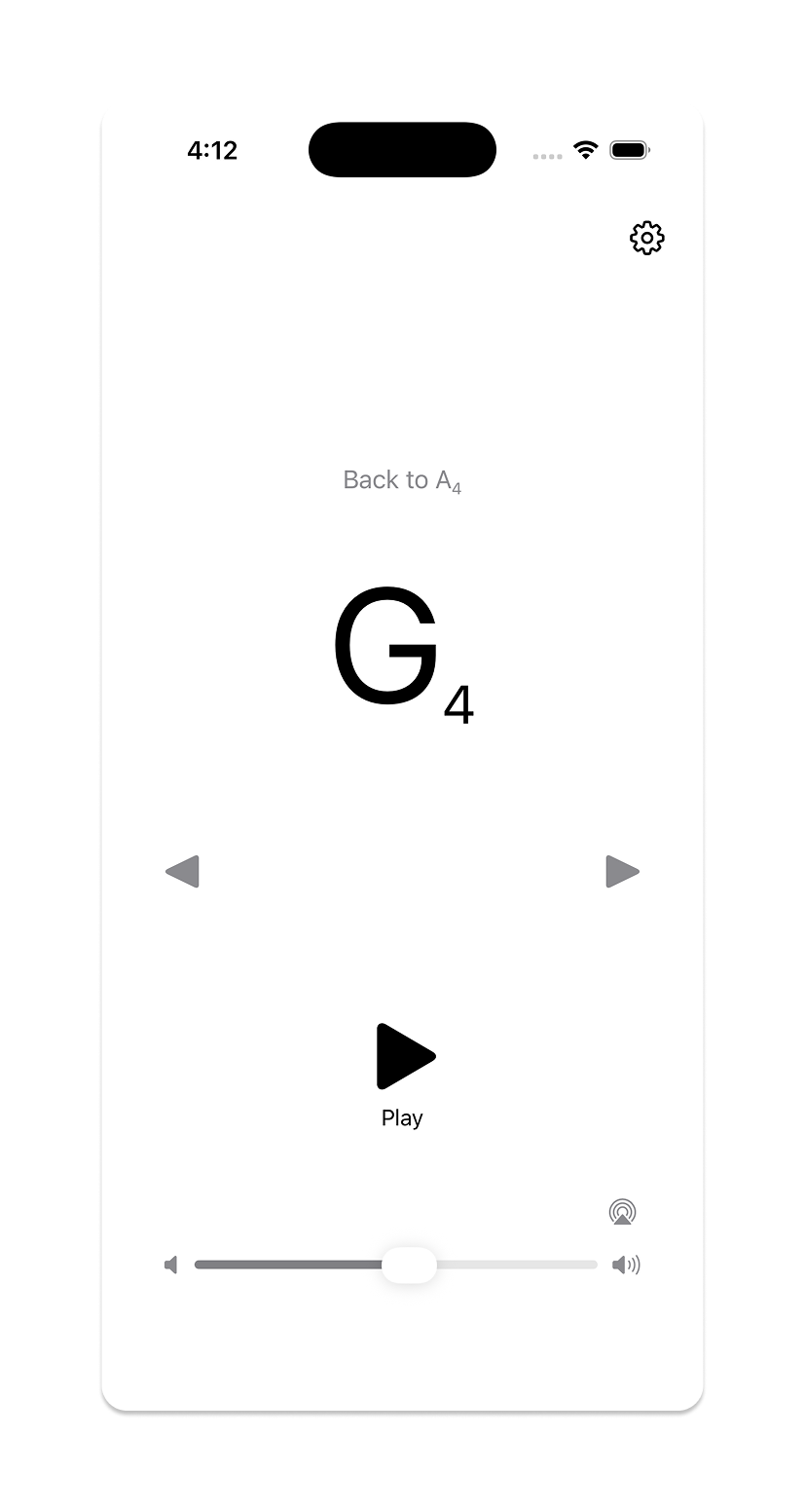
Tuning Note showing the note wheel at G4
Outcomes & What I Learned
Both apps are live. The process that produced them is documented, replicable, and transferable.
What the process looks like now
Structured Projects with maintained reference documentation
One change at a time, with alignment checks between each
Figma for visual and interaction intent; words alone aren't sufficient for design
Periodic code reviews oriented around simplicity and maintainability
Direct code edits for small changes; Claude for anything architectural
Where AI assistance has the most leverage
Implementation of clearly specified behavior
Bulk research and triage (the curation workflow is the clearest example)
Architectural restructuring when given clear goals
Debugging
Where it requires the most work
Visual design—the gap between a written description and a felt quality is wide
Motion and interaction—precision of input matters enormously
Cross-platform file management—this is a human discipline problem as much as a technical one
What I'd do differently
Start the reference documentation earlier, and be more deliberate about deprecating old files the moment they're superseded. The file management issues in Refrain were all traceable to that.
The broader point
Learning to direct AI to build something is a design skill. It requires the same things good design direction always requires: clarity about what you want, precision in how you describe it, and the judgment to know when something is close enough and when it still needs work.
Refrain and Tuning Note exist because I wanted them to. Not because they fit a business case or a product strategy—just because I thought they'd be good to have in the world. With today's tools, that turned out to be reason enough.