

Back & Forth
Supporting teachers serving in-person and remote students simultaneously
December 2020–June 2021
Research & Design Methods

My teaching experience and a passion for equity led to researching hybrid classrooms and designing solutions for educators.
The Problem
How might we support a workflow for teachers evaluating and responding to both in-person and remote student work?
The Work
Detailed and focused competitor research
Primary user research
User flows
Site map
Personas
Low-fidelity sketches
Wireframes
Wireflows
Style guide
High-fidelity screens and prototype
The Solution
A high-fidelity mobile prototype of a product that:
Makes it easy for teachers and students to send documents and assignments to each other when they are not in the same place;
Will be just as seamless for the teacher and students as when a teacher hands out a worksheet in the classroom.
During the Covid-19 pandemic, teachers’ jobs became extremely complex. Many of them were asked to teach students in a classroom and students on a video-conference call at once. Teachers had to try to provide the same care and attention for students in the classroom as students whose only window into school was their computer screen.
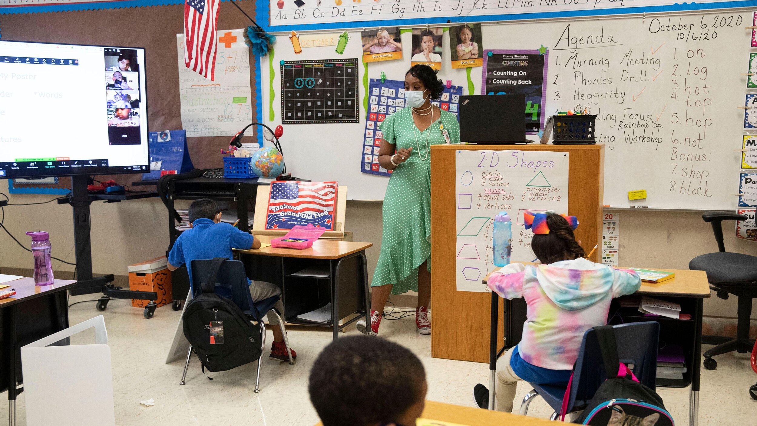
Bob Daemmrich / Alamy Stock Photo
In some ways, these challenges are unique to Covid—but in reality, teachers are often asked to teach one or two students who are out of the building, and it is always difficult to serve those students equitably.
I taught high school English for seven years. My background in education led to the development of Back & Forth. Back & Forth is an application that supports a workflow for teachers providing, evaluating, and responding to both in-person and remote student work.
Deliverables included:
Detailed and focused competitor research
Primary user research
User flows
Site map
Personas
Low-fidelity sketches
Wireframes
Wireflows
Style guide
High-fidelity screens and prototype
Users and audience
Elementary school teachers.
Roles and responsibilities (Solo project)
UX Research
UX Testing
UX Design
UI Design
Tools
Pen and paper, Sticky notes, Sketch, InVision, POP, Miro, Zoom
Scope and constraints
The project was constrained by the lack of input from a software developer or industrial designer. I was also not able to interview or run usability tests with students.

Research
There is no shortage of articles and essays about the problems and opportunities of the current situation in education.
As a teacher, I had a lot of thoughts going into this about problems that need solutions. Secondary research in major newspapers and education-specific magazines and journals affirmed these impressions and revealed specific directions forward.

When any students are learning remotely, collaboration is difficult.
Remote students are falling behind classmates.
No existing products address the remote and in-person student gap.
Surprisingly, some students thrive learning remotely.

Secondary research report
While these problems are particularly acute during the pandemic, differentiating instruction for remote and in-person students is a part of the larger current educational transformation.

“History may prove the situation with COVID-19 as a watershed moment of true transformation for K-12 systems.”
Susan Patrick, CEO of the Aurora Institute
Education Week, November 2020
User Interviews
I completed five interviews with a range of educators, searching for specific areas that need support in hybrid classrooms.
All five primary interviews were with teachers working in “hybrid” classrooms—that is, a mix of in-person and remote students simultaneously. These teachers ranged from public school elementary teachers to private high school teachers. I reached them by distributing a brief survey and contacting relevant participants.
Guiding research questions included:
When do remote students experience a disconnect with their in-person classmates?
When do teachers experience difficulty integrating remote students into classwork?
How do teachers most commonly try to connect remote students with their classmates and integrate them into the class?
What ideas and desires do teachers and students have about how they might narrow the gap between these experiences?
With these research questions in mind, the interviews were wide-ranging and driven by the educators’ experiences.


Affinity Mapping
Primary research revealed seven affinity areas in teachers’ experiences working with both in-person and remote students at once.
The most productive method of analyzing the initial user interviews was building an affinity map. Noteworthy comments, questions, and observations from these teachers revealed seven affinity areas that became guiding concepts for the project.
Student experience
Teacher experience
Talking
Paper vs. digital
Time and routines
Equipment and technology
Teaching joys

While these problems are particularly acute during the pandemic, differentiating instruction for remote and in-person students is a part of the larger current educational transformation.
Personas
I developed two personas to consider—an experienced but tech-skeptical teacher, and a novice but tech-savvy teacher.
The goals and frustrations of these personas were modeled after the research.

“How might we…” Problem Generation
Analyzing teachers’ affinity areas and concrete problems led to a focus on tools, technology, and routines.
Teaching is full of so many different simultaneous tasks that narrowing the focus to a manageable problem was a challenge. It became clear that any solution needs to fit into a teacher’s routine. My research showed that technology can quickly become a headache for teachers, so any solution also needed to make things simpler, not more complicated.
Routines
How might we help teachers provide and organize materials for elementary school students?
How might we support a workflow for teachers evaluating and responding to both in-person and remote student work?
How might we help teachers involve remote students in work happening in-person in the classroom?
Tools & Technology
How might we simplify the technological demands on teachers?
Heuristic Evaluation of Competitors
There are no educational products that address the disparity between in-person and remote students in the same class.
There are countless educational applications and services being widely used by educators struggling to teach remotely. Not one of them specifically addresses this disparity between in-person and remote students in the same class.
For this project, I specifically considered Google Classroom, ClassDojo, and SeeSaw.

Google Classroom is notable for the control and freedom it gives its users.

ClassDojo is notable for the way its system matches the real world. Its weak areas were user control and freedom, and flexibility and efficiency of use.

SeeSaw is also admirable for the way its system matches the real world. Its weak area was in its flexibility and efficiency of use.


Solution Ideation
After exploring a few directions, I focused on designing for teachers and remote students struggling to get materials “back” and “forth.”
Over and over, I heard teachers talk about how difficult it is to quickly provide materials to remote students in the same style as in-person ones, while teaching both at the same time. Teachers are not easily able to check in on remote students’ progress, students get frustrated without quick check-ins, all while their classmates in the classroom are moving forward through material.
I considered several different approaches to helping with this problem:
An always-on “dock”
So remote students could literally be a part of an in-person classroom.

The dock could just automatically be a part of the teachers' projected screen.
The dock might include remote students’ live videos as well as written messages and comments.
The dock could live on both the teacher’s computer and their projected screen.
A printer, scanner, and application
That work in tandem to easily hand off documents and assignments.

This solution would require the synchronization of three different tool: printer, scanner, and app.
If a printer and scanner were designed as a part of this solution, perhaps the printer could have its own controls to match the app’s.
Documents sent between teachers and students will have to follow particular and complicated paths.
In the end, I ended up focusing on the handoff of documents and assignments.
One teacher said,
“I would love to be able to send instant paper copies—that’s a fax machine, I know, but still…”
which got me thinking...
What if there were a way to mirror the action of handing a student a document, and then collecting it back, that was straightforward and effective?
User Stories
A minimum viable product needs to support connections between teachers and students. Student-to-student connection can come later.

As I developed the user stories for what this product might look like, it became clear that the MVP needed to be focused on teacher–student interactions. A tool like this could perhaps be useful for student–student interactions, as well, but the minimum viable product would be limited to the connection between teachers and students.
Teacher-student connection

Student-student connection
User Flows
Since this project is all about efficiency, speed, and ease, the user flows required thoughtful initial designs and many iterations.
For the prototype, I decided to focus on the teacher’s experience of sending a document to a student three different ways. A user might want to send a document from a digital file manager (like Google Drive), by taking a photo with their phone, or from a scanner. Several questions came up while designing the user flow. The flow went through several iterations during preliminary stages and after later usability testing.
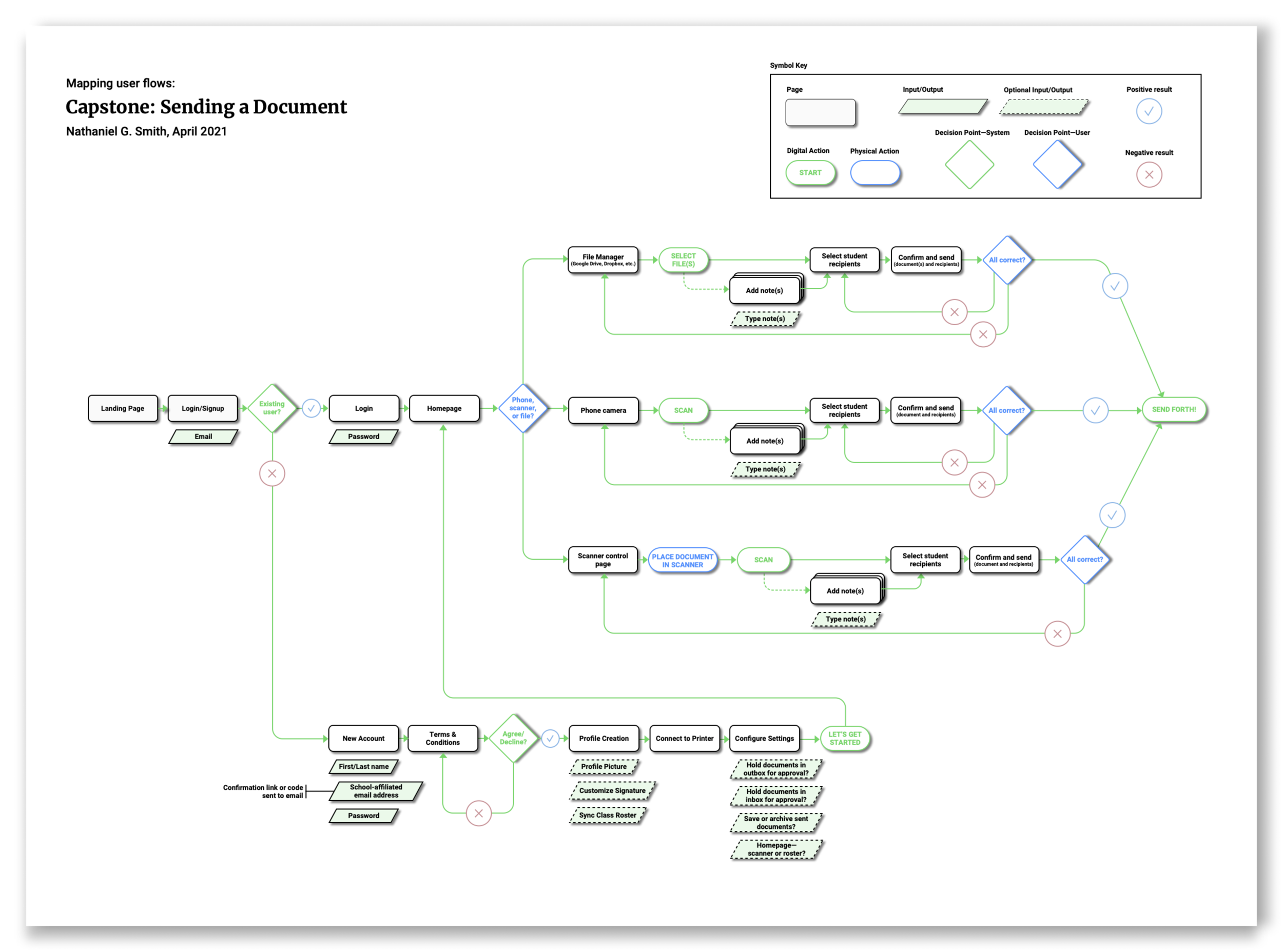

How do users think about sending a document? Do they expect to choose the recipient first, and then choose the document? Or choose the document, and then the recipient?
Composing an email usually involves thinking about the recipient first. When handing out a physical document in the classroom, however, a teacher will pick up the document first, and then hand it to the student. As I worked on the user flows, and imagined a teacher trying to fit this application into their classroom routines, it became important to map the system onto the real-world process as much as possible.
Since it is meant to be a quick way to “hand” a pre-existing document to a student, the user flow does not require a way to write or create extensive notes or messages. However, it was clear from my research that sometimes a quick sentence or two for a remote student might be helpful. So, another question to address became:
What is the best way to structure the experience of adding a “note” to a document?
Site Map and Wireflows
Exploring the structure, layout, and design questions using multiple tools.


Low-fidelity sketches
Early sketching focused on clear passage for the users from beginning to end, with consistent options to correct mistakes and exit the process.
One of the core concepts that came out of early user affinity mapping was the importance of teachers’ time and routines.
Early sketches of the user interface focused on designing for swift motion through the red routes.
At the same time, it also involved building on the user flow’s focus on control and freedom. Examples of this are including a “cancel” button on every screen, and building in a final “confirm” screen that allows a user to correct any mistakes before finishing the task.

Usability Testing and Wireframe Design
Usability tests revealed a few moments of user confusion that were later solved with graphic design and language revision.
After building a low-fidelity prototype in Marvel’s “POP” application, I ran usability tests with five different educators. There were several key findings that led to revisions.

The Home Screen needed clarification. Specifically—what actions are possible? And what are the tabs at the bottom?

Users need a quick way from the final “Confirm” screen to edit a previous screen and return to “Confirm.” I considered the “Confirm” screens of popular applications like Airbnb.

The “Add note” tool is a secondary feature that is unnecessary and confusing for some users.
Style Guide
Tools for teachers need a friendly and simple style that children and adults can both access.
Back & Forth is both about motion and reliability, supporting teachers as they guide their students. Images that captured Back & Forth’s core qualities included owls, schoolhouses, lighthouses, and city streets. Several interesting possible color palettes grew out of the mood board, settling on a reliable and supportive blue, wise and stimulating brown, and a brilliant yet stable aqua blue accent. The owl—a symbol of wisdom, flight, magic, and education—formed the basis for the logo.


High-fidelity Mockups
The use of color and the design of UI elements evolved during the building of the high-fidelity mockups.

Home screen
File selection screen
Camera screen
Document screen
Student selection screen
“Confirm and send” screen

Usability Testing
Usability testing revealed further areas for improvement involving user flow and effective use of language.
Next, the project involved five usability tests with educators. These were 20–30 minute sessions featuring three user-driven tasks. My objectives were to determine:
Can users choose a file to send, write a note, and send it?
How do users respond to the navigation style?
Do users feel like they have control over the process?
More specifically, I was curious about these experiences:
Is the document check screen too dense on the camera/scan route?
Is the navigation through the process clear?
Is the confirmation screen effective?


Discoveries & Revisions

Navigation labels sometimes made it unclear what a user’s “next step” should be.
The solution was to change the navigation buttons from “Titles” of the next step to simple “Back” and “Next” buttons with subtitles.

Language like “scan” in the “send documents by camera” flow route was confusing.
I revised screens in that user flow to feature a classic “camera” button, and a simple “Take” and “Re-take photo” subtitle.

It was unclear for some users how to change or edit documents from the “Confirm” screen.
This was partly due to semantics, so I changed the button from “Edit” to “Review.”

Months of research and design led to a viable product that would support teachers. There is still more work to do.
After several months of work, the final result is a high-fidelity Back & Forth prototype. Designed for elementary school teachers and students, this application:
Makes it easy for teachers and students to send documents and assignments to each other when they are not in the same place;
Will be just as seamless for the teacher and students as when a teacher hands out a worksheet in the classroom.
If this project were to continue, there are a few areas where the design process can be improved.
All of the user research conducted was with teachers. Just as much, if not more, needs to be learned from students’ experiences.
When designing color palettes, there are two things that would make the process easier and stronger. Sampling and perhaps borrowing from other color palettes can be helpful! It would also help to have a strong sense of the visual hierarchy and intended use for different types of colors before working on the palette.
As the world moves further and further into the digital realm, we are also learning when working with physical materials is more meaningful and effective.
Schools, and the experiences of teachers and students, are one of the most important examples of this. Projects like this one matter because they can help teachers better serve all students, wherever they are.
The less teachers need to worry about figuring out how to use technology to deliver material, the more they can focus on the craft of teaching itself.
